The episodic documentary series A Martial Artists Life focuses on individuals who do martial arts. The episodes observe martial artists that do Muay Thai, Jiu Jitsu, Wrestling, Kickboxing, Boxing, or Taekwondo. Within each episode, a martial artist will discuss their involvement in their sport, what they have gained, and their journey practicing their sport. In addition, discipline is a consistent theme throughout the various martial arts so the martial artists being interviewed will discuss discipline and what it means to them. The series works to introduce normal everyday people to martial arts and martial artists.

The documentary series A Martial Artists Life was inspired by the Ultimate Fighting Championships embedded series. Much of the research done prior to production involved watching and analyzing the various techniques used within the UFC’S embedded vlog series. In addition, much of the content the UFC releases including their fighter focus series, UFC Connected, and Dana White’s contender series were used as a source of inspiration.

The typical conventions of documentaries include interviews, photographs, archived footage, and voiceover narration. Within the documentary, the use of these conventions is evident. The interviews with Mauricio Gomez in the Jiu Jitsu episode are used to progress the storyline of the episode, archived footage was used at the start for a montage of the interviewee's competition and for when he discusses his black belt ceremony, and photographs were used throughout aligning with what is being discussed. Audio from the interviews was used as voice-overs over some of the shots, photographs, and archived footage. The use of voice bridges, sound effects, and background music was also implemented. Specifically, at the start of the documentary sound effects of birds can be heard within the establishing shot. This was used in order to create a feeling of being outdoors in the early morning. A voice bridge was used to transition from the initial shots into the interviews. And lastly, the mellow background music was used to set an upbeat yet calm tone.
Typically within documentaries reenactment is a common convention used. For A Martial Artists Life reenactment would be difficult to achieve. It would be impossible to reenact specific moments such as competitions, belt ceremonies, and moments throughout the martial artist's journey. Because of this, primarily the use of archived footage and photography is seen.
As A Martial Artists Life is focused on Martial Arts, the target audience would be people who are martial artists or interested in trying martial arts. The age range for this target audience would be from 16-40 and the majority male, as most martial arts content is viewed by males. The use of a montage at the start of the excerpt would adhere to the target audience's desires. A lot of fighting content is fast-paced and action-oriented, which the montage is. It is used as a way to hook the audience into the episode and become interested in the interviewee Mauricio.
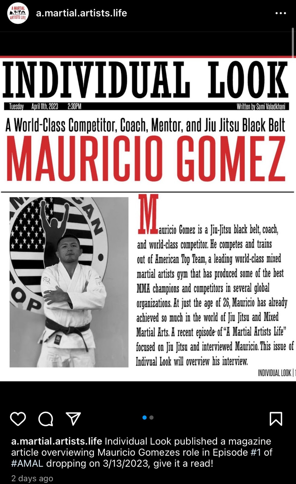
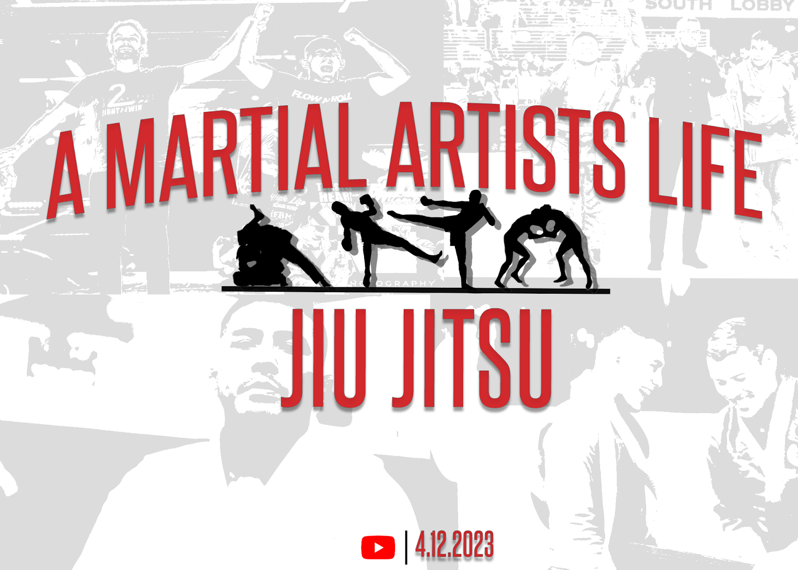
The brand for the production is meant to be simple and bold. The color scheme consists of white, black, and red. Commonly, the color red is associated with martial arts and fighting in general. Within the documentary, all of the text including the title, subsections, and interviewee credits are red and white and use the same font named “steelfish”. Similarly, on the social media for the documentary red, black, and white are the primary colors for the logo, and the same font is used.
Many of the posts also contain red, black, and white. The posts are focused on the release of the documentary and highlight Mauricio. Furthermore, on the Instagram page the words “AMAL”, short for A Martial Artists Life, are spelled out on the story thumbnails. The use of the same font and color scheme creates a sense of branding. The logo is used as a watermark in the bottom right corner of the documentary as well. In addition to the consistency between the social media and the documentary, the magazine article focusing on Mauricio's interview within the piece used the same color scheme and font.
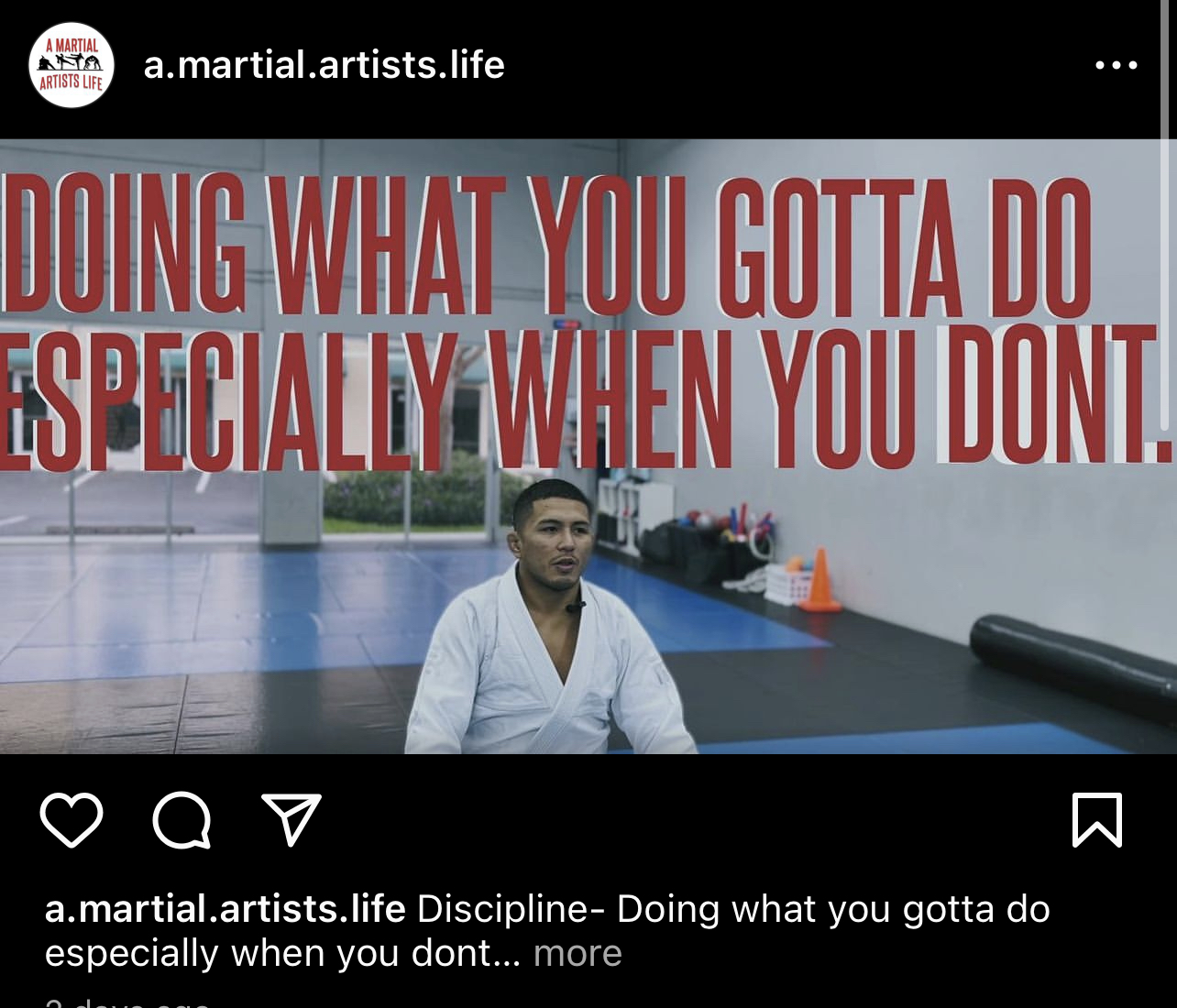
The documentary works to represent martial artists. A common misconception about martial artists is that they are aggressive and chaotic. Most people associate the sport with violence and typically not hard work, discipline, and dedication. In order to properly represent martial artists, I wanted to focus on discipline in one of the sections. Discipline is a core component of every martial artist's life. It is essential a martial artist has discipline because without it it’s very easy to give up on yourself. Mauricio discusses discipline and what it means to him. I wanted to get an insightful response so I asked him about how martial arts has given him discipline in other
parts of his life. This gave some great responses that represent the importance of discipline to martial artists.
In addition, in order to properly represent the sport of martial arts it was crucial to discuss the difficulties and benefits of the sport. The sport is evidently very physically and mentally demanding. Many martial artists begin the sport as a way of self-therapy. This is very common within the social group of martial artists. Practicing martial arts many say decreases their aggressiveness and help people mentally. The sense of community within the sport makes previously anxious people grow more extroverted. Mauricio discusses how it has helped him become a calmer person and more open person. Discussing discipline and the benefits of mental health allows martial artists to be properly represented within the documentary.

Making this documentary really got me closer to my coach. I have known him since the start of my martial arts journey and I learned a lot about him during my interview. It was an amazing experience interviewing him and getting to know more about his past. It really developed a new level of respect. I am glad that I get to represent the respect, discipline, and dedication martial artists have through this documentary.